Why Initials Make a Name Feel Like a Mark
Learn how to shape initials into a readable public mark, with practical ways to compare letterforms and layouts across signs, forms, and small surfaces.
The common mistake with initials is treating them as a shortcut: take the first letters of a long name and assume the identity is finished. That can leave a dense cluster that is hard to read and disconnected from the name people recognize. An initials mark works best when its compact shape still points back to the full name.
Start with the words, not a typeface. On a page or sign, initials become an arrangement of strokes, gaps, and proportions, so look at both what the letters say and how they sit together.
Write the full name before drawing the initials
Write the organization’s full public name exactly as it should appear. Mark the words that would contribute letters, including small connecting words such as “of” or “and.” This makes the abbreviation choices visible before a polished design obscures them.
Write the proposed initials on a separate line, keeping the name’s original word order. Then check whether they reflect the name people actually use. If the organization is commonly known by a name that includes a place, service, or community, leaving that word out may make the initials harder to recognize.
Say the full name aloud, then read the initials as they might come up in conversation. This can reveal a mismatch between the public name and the compact form. If people naturally use another short name, consider that habit before giving the initials a prominent place.
Record both versions, including capitalization and punctuation, so you have a consistent source for visual comparisons.
Judge the initials by their letter shapes
Write the initials in plain uppercase letters in a neutral typeface. Set color and decoration aside, and notice open spaces, tight corners, repeated vertical strokes, and broad curves.
Some letter pairs sit comfortably together; others can look crowded or resemble another character when reduced. A narrow “I” beside a wide “M,” for instance, creates a different balance from two letters with similar shapes. Repeated circles, diagonals, or stems can give a mark character, but closely spaced repetitions may make the letters run together.
Look at the space inside and between the letters. Designers use the term kerning for adjustments to the spacing between particular characters. Rather than relying only on a software value, inspect whether one pair looks pinched beside the others.
Try the initials in a plain text editor or basic layout program before adding a symbol. If a decorative frame is needed just to distinguish the letters, revisit the letterforms first.
Compare a few type styles against the name
Set the initials in a restrained sans serif, a traditional serif, and a heavier geometric style. Compare how each handles the letter shapes and the tone it gives the name, rather than choosing by trend.
Consider the impression the organization wants to make. A community group may favor warmth, while a professional association may prefer a more composed look. Letter width, stroke contrast, spacing, and capitalization all contribute; no single font has to carry the identity alone.
Check the typeface license before using a font in public-facing materials. If a designer or printer will prepare final files, share the full name, preferred initials, and intended uses so they understand the relationship between the letters and the words.
Keep the comparison focused. A few visibly different options make it easier to judge shape than a page of near-identical fonts.
Pair the initials with the full name when recognition matters
A compact mark does not have to replace the full name. Place the initials beside or above the complete name and check whether the two feel connected. The initials can provide a quick visual cue; the words tell an unfamiliar reader who the organization is.
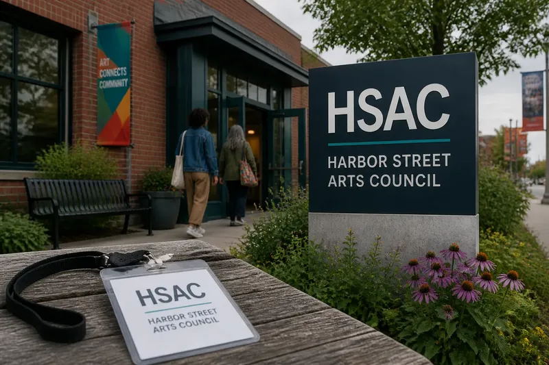
Say you are organizing a neighborhood arts group called “Harbor Street Arts Council.” You want “HSAC” on a small event badge, while a welcome sign carries the full name. Set the initials in a bold, open sans serif and place the full name beneath in a simpler face. The expected observable result is a compact badge mark and a sign that still identifies the host in full.
View the pairing in black and white as well as color. If a particular color is the only thing separating two letters, the mark may become harder to read on a photocopy, a single-color stamp, or a document printed without color. Color can support the design, but the letter shapes should remain recognizable without it.
Keep the full name close enough to the initials for readers to see the connection. A consistent layout can provide that link without adding a long explanation each time.
Check how initials behave on their intended surfaces
Mock up the mark in the places people will encounter it, such as a letterhead header, social profile image, building directory, name tag, or form. A rough layout is enough to reveal whether the available space suits the design.
View each mockup at its intended size and from an ordinary reading position. If fine gaps close up on a phone screen or delicate strokes lose presence beside heavier signs, try a sturdier font or more open spacing. Then check the revised version in the same setting.
Test light and dark backgrounds, a one-color version, and the space around the letters. Borders, nearby text, or a photograph can crowd the outline. Give the mark enough room to be seen, rather than only enough room to fit.
If the initials are too small to read on a particular surface, use the full name in plain text instead.
Which questions help you judge initials as a mark?
Should initials always use capital letters?
Capitals are common, but lowercase or mixed-case forms can suit a particular name. Compare the options in the intended typeface and setting, then choose the form that reads clearly and matches the organization’s public voice.
Do initials need a separate symbol?
No. A symbol can add meaning, but it can also compete with the letters or complicate a compact mark. Begin with the initials alone and add an emblem only if it contributes a relevant idea.
How can you tell if the letters are too crowded?
Look for letters that seem to touch, gaps that disappear, or a pair that reads like a different character at the intended size. Try another typeface or adjust the spacing, then inspect the result in a small mockup rather than only at screen-filling size.
When should the full name appear with the initials?
Use the full name where readers may not know what the initials stand for, such as introductory materials, public notices, or a first encounter. Once the connection is clear in a particular setting, the initials may work alone there.
Compare the strongest options before choosing
Place the leading options side by side in the same sizes and settings. Include the initials alone, the initials paired with the full name, and a plain-text version. Like-for-like comparisons help distinguish a strong letterform from one that merely received more visual attention.
Ask someone unfamiliar with the draft to read the initials and identify the full name when it is shown. The purpose is to see whether the relationship is clear, not to seek approval. If the connection is confusing, revise the lettering or show the full name more often.
Before finalizing, check spelling, capitalization, and punctuation against the chosen public name. If official naming rules, trademark questions, or typeface licensing affect the decision, consult the relevant owner’s instructions or a qualified professional.
Treat initials as a small, repeatable signature, not a replacement for every word. For a public-facing initials mark, keep the full name nearby when recognition matters, and let consistent, readable use establish the connection.